My Career Advisor
My Career Advisor is a career path-building tool designed to help second-chance job seekers, veterans, and high school students. Many of our users had never touched a mouse before.
Industry
Career Services
Client
Goodwill
Service
Website + Mobile Design
Timeline
2022-2024
My Role
Deliverables Shown
Team
Song
QKThr - Aphex Twin

Overview
Our team was tasked with redesigning and assessing the functionality of My Career Advisor for it to serve a wide range of individuals. For example, someone who has never touched a mouse before, a veteran reaclimating to civilian life or a tech-savvy high school student.
I suggested the utilization of the Double Diamond design process with modifications to the team to make this overhaul more digestible.
Problem
The outdated UI did not meet WCAG AA standards and this contributed to the unclear visual messaging of the site's features and resources. The user flows throughout the site were not guiding the user through the career-building process in a functional manner.
Results
We saw an 87% increase in usability of the features across the website with the user flow functionality reassessment. We improved the UI of the website by curating an accessible design system and implemented branding elements/illustrations similar to other competitors.
Glimpse: Original My Career Advisor
Dug through the archives to find the early stages of MCA. We are looking at the dashboard after some minimal UI changes and the original homepage. Various dated elements had to be reworked during this overhaul while still keeping the code's integrity so that we could lessen the burden for our developers.

Curating a Design System

Feature Prioritization
We took each main feature and process and broke down the functional purpose of each, reassessed the flow, and gathered insights from users on what integral pieces users were having issues with. Finding solutions while continuing to satisfy business needs was challenging but rewarding overall.
Below is a quick look over of the key features that I focused on and what each assessment entailed keeping the Double Diamond design process in mind throughout.

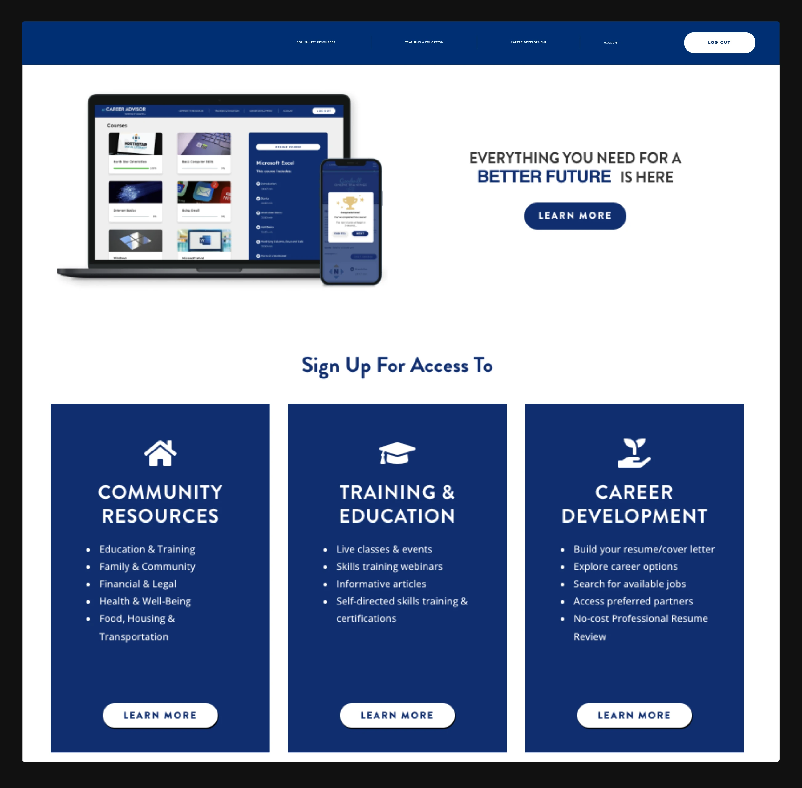
Homepage
Improving the user's introduction to the website and visually highlighting the key features now at their fingertips.


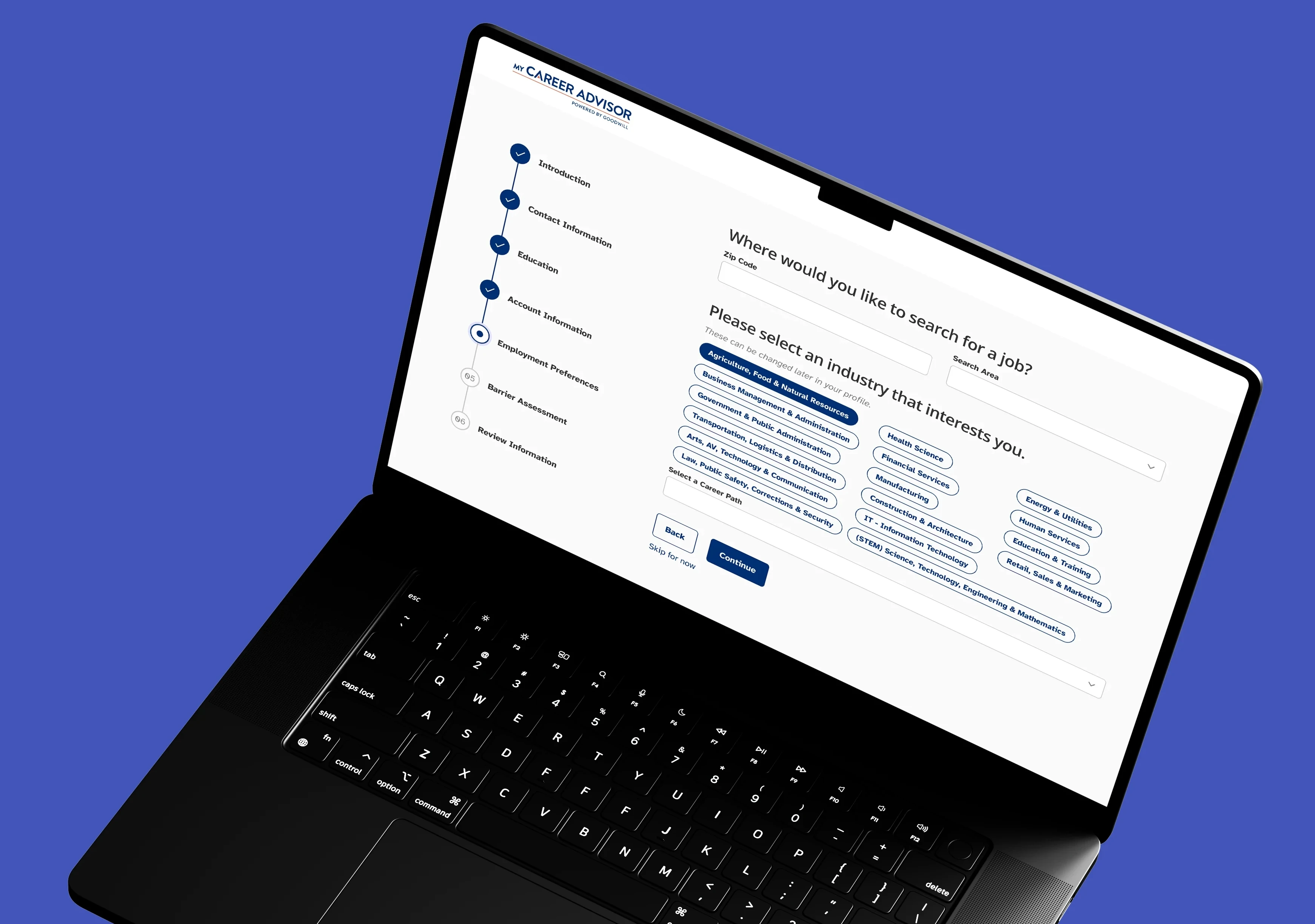
Intake
Breaking down the information-gathering process to deliver a more consumable and simplified experience.

Dashboard
Designing functional aspects that give the users more hands-on data and shortcuts for their career-building journey.


Online Training
Designing a seamless flow for users going through the training material to easily track progress and increase motivation.
Found Inspiration From Competitors to Improve Our Home Page
First impressions are important in every aspect of the world and home pages should not be the exception.
We took a look at our competitors and how they visually invited their users to utilize their services. With our broad audience, we wanted a friendly and easily understandable introduction that told the stories of our users. Illustrations with brief descriptions made the most sense and our user feedback agreed.

A Complete Redesign of the Dashboard
Originally the dashboard served very little purpose for the user and according to our Hotjar data, users spent an average of 3 seconds on the page — that had to change.

Improvements made fueled by user research and competitive analysis:
Redesigning the quick profile view with clean UI elements
Added alerts so the user can quickly access incomplete materials/assignments sent to them by their career coach
Added an upcoming tasks progress section to give the user an overall look into the resources available to them without having to search through the navigation
Added shortcuts of our most sought features according to user research from users and career coaches
Added a quick view of the user's online training progress that increased motivation and provided shortcuts to jump directly back into the user's training

A More Personalized Experience for the Intake Process
The previous intake was a long process that had little guidance and didn't serve any purpose for the user once completed.
We wanted to take this information-gathering process and visually and functionally simplify it for the user and provide a personalized experience that continues once they enter MCA.
We incorporated a progress bar that visually communicates to the user a short-time commitment
We improved the UX copywriting to be more personable for the user throughout the intake experience
We provided a shorter intake experience for high school students who did not need to provide in-depth background information for safety purposes
We made sure the information being gathered is going to be auto-populated in the user's respective profiles to mitigate having to enter their information multiple times

Visual Modifications to Foster Motivation for Online Training
A key focus of the functionality assessment of Online Training for the redesign was finding a way to increase completion motivation through visual elements. We also wanted the user to have a strong grasp as to where they were at every step in their training. To solve this we implemented informative and interactive sidebars and progress bars.

Reflection and Considerations
During my tenure, My Career Advisor was able to improve its accessibility and functionality standards for the wide spectrum of users, increase its B2B sales of the product for other Goodwills within the network, and craft a harmonious visual brand across its pages.
Even with a junior team, we created many iterations to play to each other's strengths and minimize weaknesses. I am proud of the product we were able to enhance to forever help second-chance job seekers, veterans, and high school students find and build their career paths.